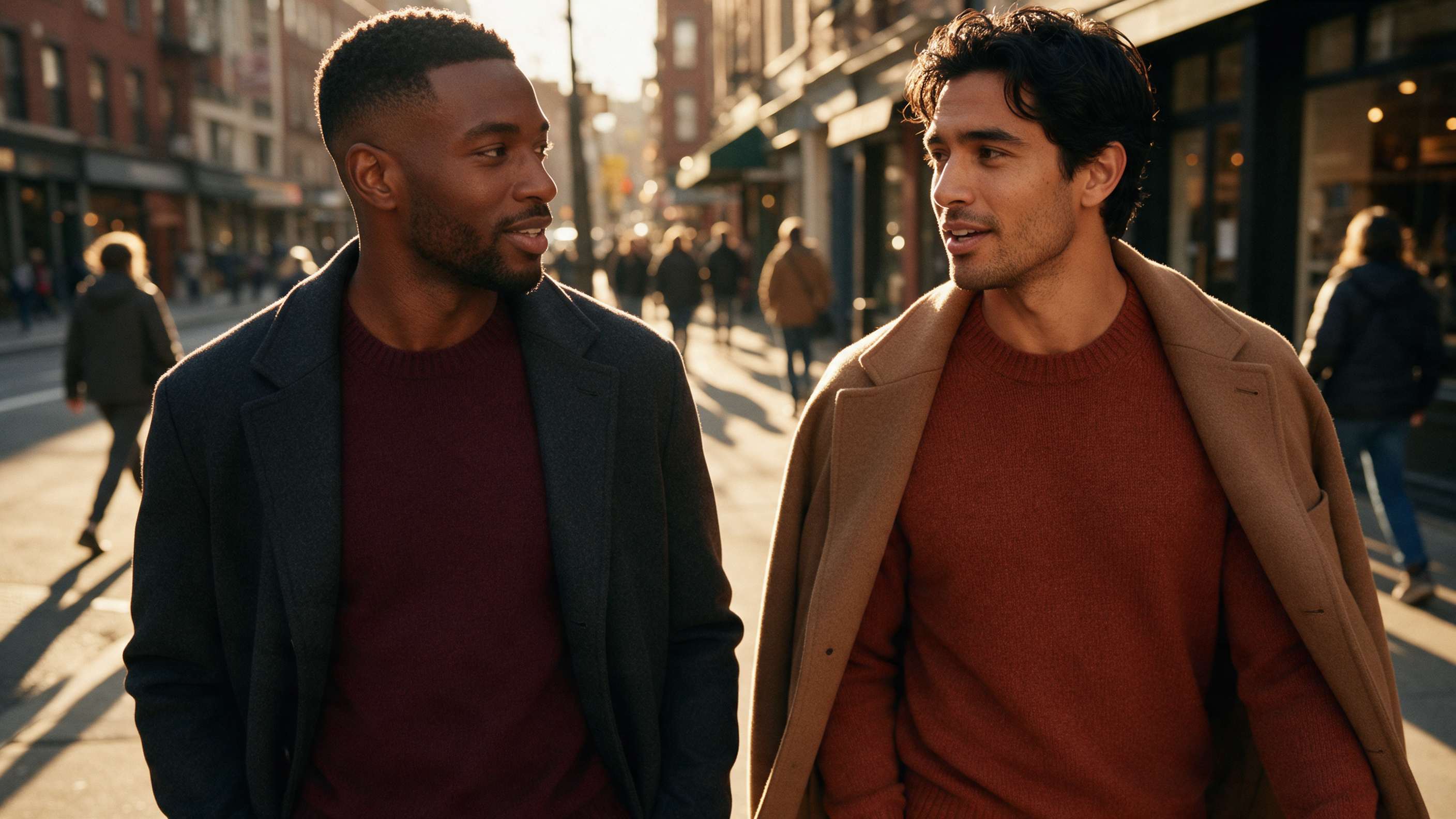
Most "best colors for dark skin men" articles are the same chart copy-pasted across the internet: jewel tones good, pastels bad. The problem is that they skip the three variables that actually decide whether a color works on you — your undertone, your contrast level, and the lighting of the situation you're dressing for. This guide fixes that. You'll get the color science that applies to every skin tone, the palettes that perform best on dark and olive complexions, and ready-to-use color decisions for three specific scenarios: interviews, dates, and being on camera. And if you'd rather skip the manual testing entirely, an AI color analysis tool like DLOOK can identify your undertone and seasonal palette from a single selfie in seconds.
1. Why Most Color Advice for Dark & Olive Skin Misses the Point
The internet's one-size-fits-all advice — "wear jewel tones, avoid pastels" — treats skin depth as the only variable. It isn't. Two men with equally deep complexions can have completely different undertones: warm (golden), cool (rosy), or olive (a green-gray neutral band that borrows from both). A rust-colored shirt that looks rich and intentional on a man with warm undertones can look flat against cooler skin, and vice versa.
Color perception research supports this nuance. A widely cited review in Journal of Experimental Psychology found that color's effect on how we're perceived depends heavily on context and pairing, not on any single shade in isolation — which is exactly why blanket lists fail. Color is a tool for signaling, and the signal changes with contrast, fabric, and light.
So instead of "colors that work on dark skin," this guide teaches you how to find your own palette — then gives you scenario-tested shortcuts.
2. The Color Science That Applies to Every Skin Tone
2.1 The Skin Tone Spectrum
Skin depth exists on a spectrum from fair to deep — and darker complexions span nearly the full range of undertones. Depth describes how much melanin is present; undertone describes the hue underneath. They're independent variables, which is why "dark skin" is not a single color category for wardrobe planning.
2.2 Warm vs. Cool vs. Olive Undertones
Three quick at-home tests (none are perfect — combine them):
The white T-shirt test: Hold pure white and off-white/cream against your bare chest in daylight. If white looks crisp and sharp, you likely lean cool; if cream looks healthier and more even, you likely lean warm.
Jewelry test: Compare gold and silver against your jaw. Warm undertones tend to glow beside gold; cool undertones beside silver.
Vein test (limited): Greenish veins suggest warm, bluish suggest cool — but this test is unreliable on deeper and olive complexions, where veins are harder to read.
Olive undertone is the third option: a muted green-gray quality that reads as neither clearly warm nor clearly cool. If gold and silver both look fine but the wrong colors make you look sallow, you're probably olive. This framework maps directly onto seasonal color analysis for men, which assigns everyone one of 12 seasonal palettes.
2.3 Contrast: Your Hair, Skin and Eyes Work as a Palette
The second variable is contrast — the difference in value (light/dark) between your hair, skin, and eyes. High-contrast men (deep skin with very dark hair, or light eyes against deep skin) carry bold pairings like a crisp white shirt against a charcoal suit with ease. Lower-contrast men often look better in tonal, medium-value combinations where nothing competes for attention. Contrast explains why one "universally flattering" outfit can look electric on one person and ordinary on another.
3. Best Colors for Dark Skin Men: The Core Palette
Here's where nuance pays off. Deeper complexions with warm undertones often pair strongly with rich, saturated shades; cooler undertones shine in clearer, slightly bluer versions of the same families. The safe core palette:
High-contrast neutrals: Crisp white, charcoal, true black. White against deeper skin creates a clean, deliberate frame — use it when you want to look sharp. Charcoal is the most versatile neutral for work; black works, but head-to-toe black can flatten low-contrast faces, so break it up with texture or a mid-tone layer.
Jewel tones: Emerald, sapphire, burgundy, royal purple. These saturated mid-dark shades echo the richness of deeper skin without disappearing into it. Men with cool undertones typically gravitate toward sapphire and emerald; warm undertones often find burgundy and deep teal especially strong.
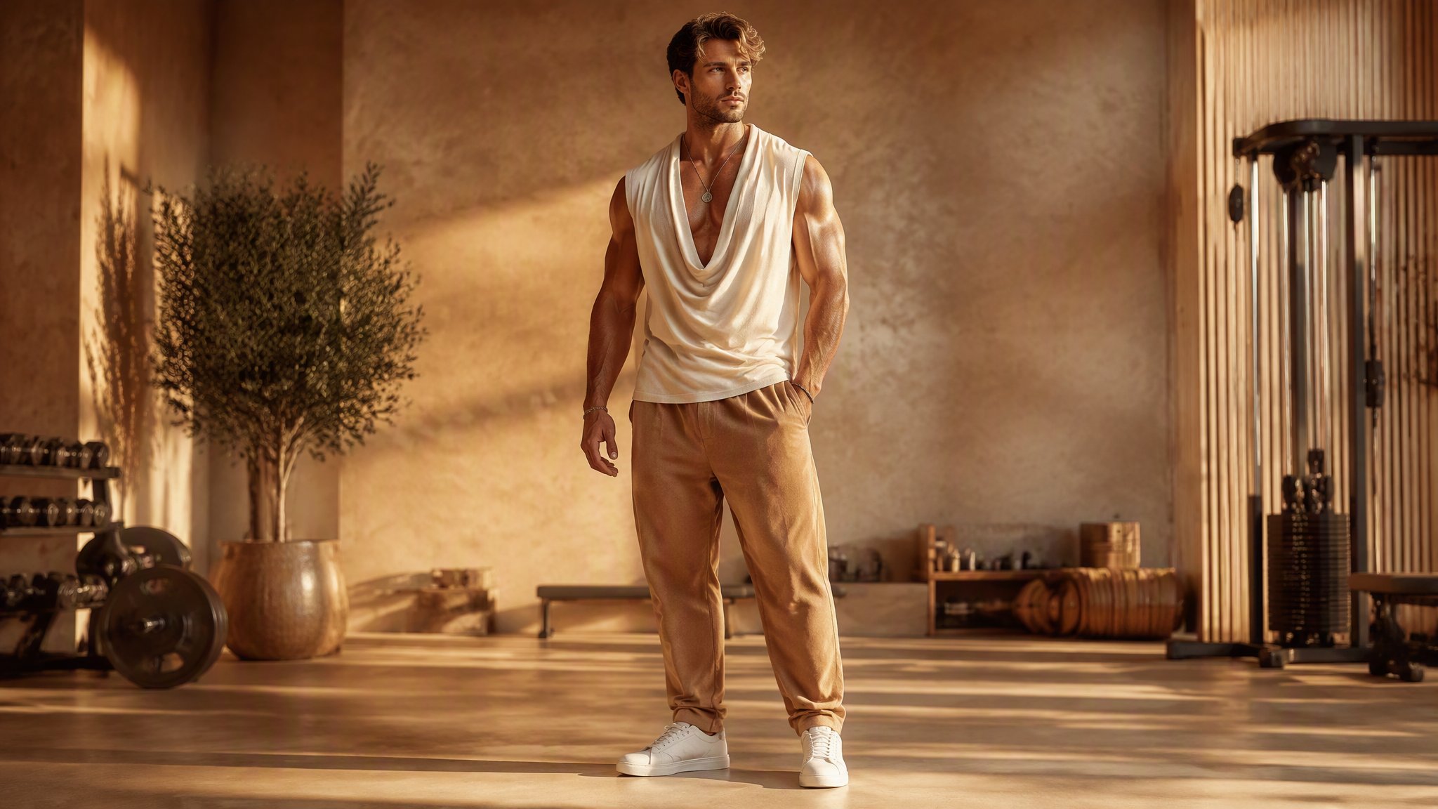
Earth tones: Rust, terracotta, olive, camel, warm chocolate brown. These add warmth and read approachable. They're particularly reliable on warm and olive undertones.
Pastels and very light shades aren't off-limits — they just need more intentional pairing. A pale lavender or butter yellow works well as an accent or when the rest of the outfit carries enough depth to anchor it. This matters commercially too: menswear is a multi-hundred-billion-dollar global category (see Statista's global apparel outlook), which means more brands than ever now offer extended colorways — you have more palette options than any previous generation of men.
4. Best Colors for Olive Skin Men
Olive skin sits in a genuinely unique position: the green-gray undertone acts as a neutral bridge, meaning many olive-skinned men can borrow from both warm and cool palettes. The shades that consistently perform:
Rust and burnt orange — the warmth offsets olive's natural green cast
Moss green and khaki — tonal with olive skin, creating a sophisticated low-contrast look
Warm brown and camel — reliable neutrals that never fight the undertone
Burgundy — one of the few saturated shades that flatters warm, cool, and olive undertones
Navy — cooler olive skin especially benefits from navy's clean blue base
Which shades need more intentional pairing on olive skin? Bright, acidic yellow-greens can visually echo the skin's green cast instead of complementing it — the fix is pairing them with warm browns or crisp white to restore balance, not banning them outright. The same applies to very washed-out grays: give them a textured or warm-toned companion and they work fine.
5. Scenario #1: Interview & Work —

Colors That Signal Authority
The interview question — "what color suit should I wear?" — has a well-supported answer: navy or charcoal. Here's the decision logic:
Navy: The safest high-authority choice across virtually all undertones. It pairs cleanly with a crisp white or light-blue shirt, and it photographs reliably.
Charcoal: Slightly more formal, slightly more modern. Ideal for industries like law, finance, and consulting. On very warm undertones, charcoal can read a touch severe — soften it with a white shirt and a warm accent (burgundy tie, deep green pocket square).
The science here is contrast: a dark suit + light shirt pairing creates visual structure that reads as competence and authority. GQ's interview dressing advice has long emphasized exactly this principle — fit and contrast before anything else (see GQ's guide to interview attire). Accent colors are where you personalize: burgundy, deep green, or a muted gold tie signal confidence without distracting.
6. Scenario #2: Dates & Social —
Warm Tones That Read Approachable
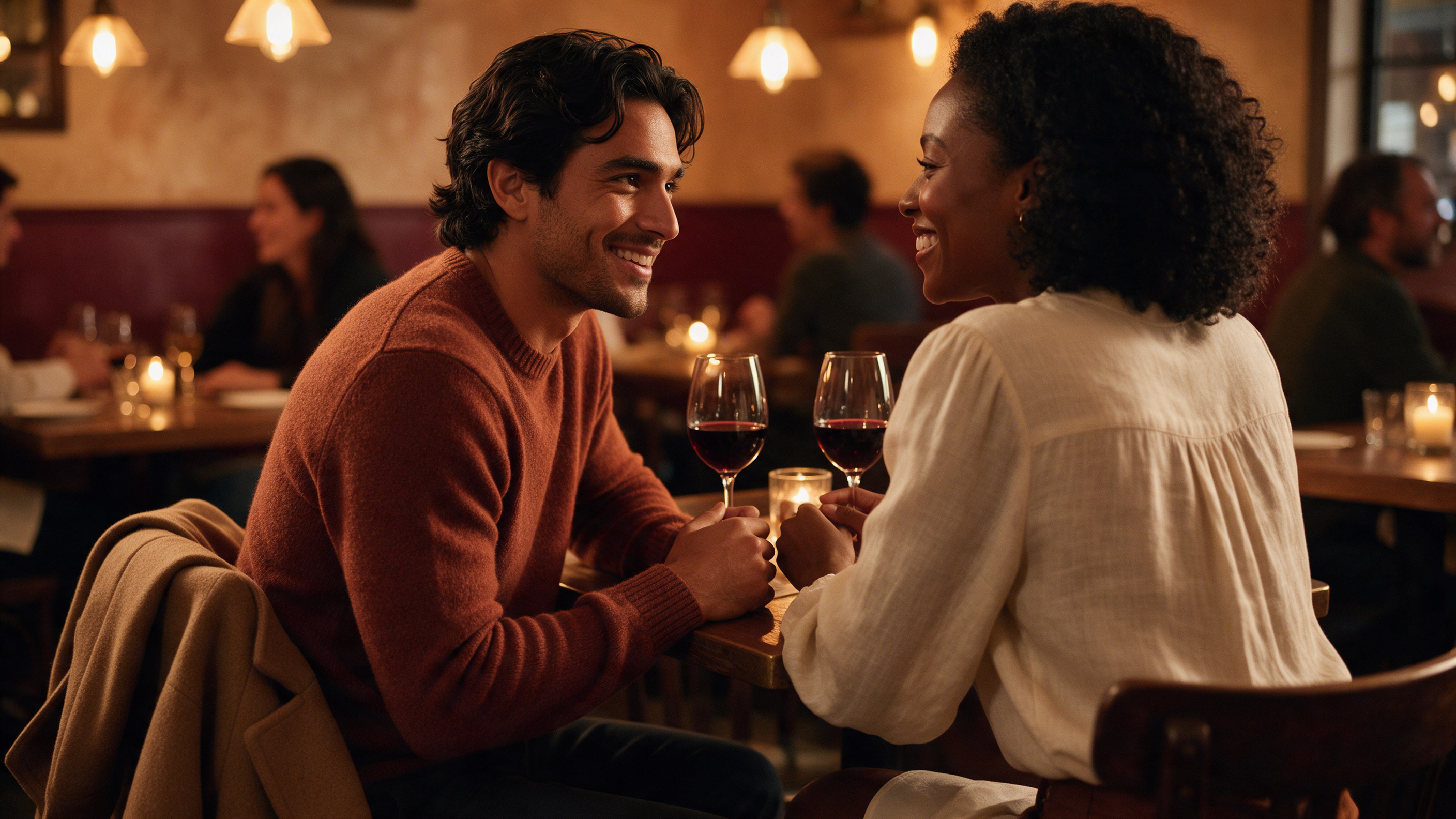
Dating and social settings reward the opposite signal of an interview: warmth instead of authority. The palette shifts toward earth tones and soft neutrals:
Terracotta, rust, and burnt orange knitwear — warm, tactile, memorable
Olive and moss green — relaxed but intentional; excellent for olive and warm undertones
Camel and cream — softens the overall palette and reads friendly under warm restaurant lighting
Burgundy — date-night's most reliable accent: rich, warm, a little bold
Texture amplifies everything here. A rust merino sweater carries more warmth than the same shade in flat cotton; a cream linen shirt softens more than a cream poplin. Deeper complexions with warm undertones often find this palette almost effortless, while cooler undertones get better results by warming it up — swap cream for soft stone, camel for taupe.
7. Scenario #3: On Camera & Social Media —

How Light Interacts With Deeper Skin
This is the most underserved topic in the entire niche. Search for camera advice and you'll find articles written for photographers — not for men deciding what to wear on a video call. The physics that matter:
Hard light creates specular highlights on deeper skin that can blow out under cheap webcams; soft, diffused light preserves the skin's natural depth. Sit facing a window rather than under a ceiling light.
Color temperature matters. Warm tungsten bulbs (≈2700K) shift colors orange and can make earth tones muddy; daylight-balanced light (≈5000–5600K, or a daylight ring light) keeps both your skin tone and your clothes accurate.
Cameras absorb saturation. A shade that looks rich in person often reads flat on a phone camera. Go roughly one notch more saturated on camera than you would in person — this is why jewel tones and deep earth tones photograph so reliably on darker complexions, while ultra-pale shades risk washing out.
Camera-safe colors: navy, charcoal, burgundy, emerald, rust, crisp white. Colors that need better lighting: pale pastels, heather grays, and anything with a yellow-green cast under warm bulbs.
The fastest way to validate all of this on your own face: upload a daylight selfie to DLOOK's AI color analysis. It maps your undertone and contrast level, then shows you your strongest shades against your actual face — not a generic chart — so you can test navy versus rust before you buy anything.
8. How to Build Your Personal Color Palette (Step-by-Step)
Put it all together in five steps:
Determine your undertone. Run the white T-shirt and jewelry tests in daylight. Undecided after both? That's a strong signal you're olive.
Assess your contrast level. Look at a photo of your face: is there a big value gap between skin and hair? High contrast → bold pairings. Low contrast → tonal, medium-value outfits.
Pick 2 base neutrals. From charcoal, navy, white, cream, camel, warm brown. These cover 70% of your wardrobe.
Add 3 accent colors — one per scenario. Authority (interview), warmth (social), camera (photos). Burgundy, rust, and emerald cover most undertones.
Validate with photos. Photograph yourself in daylight wearing each accent. The camera reveals what mirrors miss.
For a full 12-season breakdown of this framework, see our color analysis for men — it maps undertone + contrast + saturation into complete palettes.
9. FAQ
What colors look good on dark skin male?
The most reliable palette combines high-contrast neutrals (crisp white, charcoal, black) with jewel tones (emerald, sapphire, burgundy, royal purple) and warm earth tones (rust, terracotta, olive, camel). The deciding factor is your undertone: warmer undertones lean into rust and terracotta, cooler undertones into sapphire and emerald. Section 3 above covers the full breakdown.
Can dark-skinned men wear black?
Yes — black works on every skin depth. The nuance is contrast: men with high contrast between hair and skin can wear head-to-toe black effortlessly. Lower-contrast men often look better breaking black up with a mid-tone layer, texture, or a warm accent like camel or burgundy.
Is olive skin warm or cool?
Neither — and sometimes both. Olive is a distinct undertone with a green-gray cast that sits between warm and cool. That's why olive-skinned men often find both gold and silver workable, and why rust (warm) and navy (cool) can both be strong choices.
What color suit should a dark-skinned man wear to an interview?
Navy is the safest choice across all undertones, with charcoal as an equally strong option for more formal industries. Pair with a crisp white or light-blue shirt for contrast that signals authority, and personalize with a burgundy or deep green tie. Section 5 has the full decision logic.
What colors photograph best on dark skin?
Navy, charcoal, burgundy, emerald, rust, and crisp white are the most camera-reliable shades. Because phone cameras absorb saturation, go slightly more saturated on camera than you would in person, and use daylight-balanced lighting (around 5000–5600K) to keep colors accurate. See Section 7 for the lighting details.
Should men do seasonal color analysis?
Yes — it's the fastest way to turn guesswork into a system. Seasonal color analysis maps your undertone, contrast, and saturation into one of 12 palettes with a ready-made wardrobe scheme. You can self-test with the methods in Section 2, or use an AI tool like DLOOK to get your seasonal type from a single selfie.
The Bottom Line
Color isn't a set of rules — it's a set of tools. The science in Section 2 plus the three scenario palettes cover about 90% of the decisions you'll actually face. Start with your undertone, test against your own photos, and let the rest follow. If you want the shortcut, run a seasonal color analysis with DLOOK once — your seasonal palette will quietly inform every outfit decision after that.
Ready to Dress With Confidence?
Finding your best colors is only the first step — putting them into outfits that actually work is where most people get stuck. DLOOK makes it easy: take one selfie, get your full seasonal color analysis, and get outfit ideas built around the shades that flatter your dark olive skin.
Download DLOOK for iOS · Get it on Google Play · or explore more at dlook.app.